Introduction to t-SNE for Flow Cytometry
Understand the pros and cons of t-SNE, an algorithm for visualizing high-dimensional data
Adapted from the t-SNE for Flow Cytometry workshop by Robert Ladd, Facility Manager of the Flow Cytometry Core at Loyola University.

Introduction
As flow cytometry panel size increases, the dimensionality of flow data follow suit. t-SNE, or t-Stochastic Neighbor Embedding, has become one of the most widely used tools for visualizing high-dimensional flow data. In this blog post, Robert Ladd explains the advantages and pitfalls of t-SNE as a method for flow cytometry data analysis and visualization. This is part one of a three-part series on everything you need to know about t-SNE.
What is t-SNE?
t-SNE is a dimensionality reduction method. In very simple words, that means we are projecting or arranging our high-dimensional data onto a lower dimensional space, typically 2D, although you can really do any kind of representation you want. You can think of a shadow as a very simple example of this. We have some high-dimensional object, a hand for example, that is being projected onto a wall, and we see a two-dimensional image of that. We can still tell something about that three-dimensional object based on the shape of the shadow, but we do lose some information by reducing that third dimension away.
For dimensionality reduction to be useful for data analysis, we need to preserve something, ideally as much as we can, about those high-dimensionality relationships. Taking Figure 1, a very simple CD4/CD8 plot from T-cells, I could reduce this plot very easily by simply taking my y-axis away and just looking at all my dots squished against the bottom. However, in that case, I've not preserved anything about this higher-dimensional, in this case, two-dimensional data. So that is not going to be optimal dimensionality reduction.
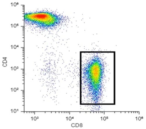
Figure 1. Two-dimensional flow cytometry data
Let me give you a very simple analogy for what t-SNE is doing.
Looking at Figure 1, especially that population in the bottom right, I could say that in my y-dimension, or my y-axis, all of these dots are similar and that they are low intensity on the y-axis. Similarly, on my x-dimension or my x-axis, they are similar in that they are relatively high values. I can draw a gate around this population, and you could say that I've clustered this data together in a very simplified sense. That's kind of what t-SNE is doing, but rather than just looking at the two-dimensional space, it's looking at however many dimensions you have in your data, twenty, thirty, forty, for mass cytometry maybe even more.
Why is t-SNE useful?
Visualizing data with t-SNE
Our output of a t-SNE is going to look something like Figure 2. This is one of your prototypical t-SNE representations. The idea is that the datapoints within each of these clusters have some level of high dimensional similarity, so if we were to look at all of the possible parameters that we would normally plot, dots within the same cluster are going to be very similar in some or most of those parameters.
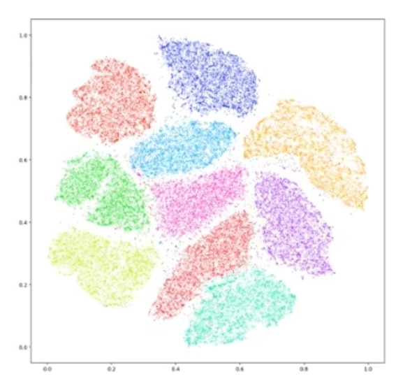
Figure 2. An example of a t-SNE plot.
There are some limitations of typical flow data presentation that this can help us get around. With flow data, we easily plot data into one dimension, two dimensions, even three dimensions. And if we really wanted to go crazy, we could go further. We could have a three-dimensional plot where every dot has its own color or shape or opacity. We can add dimensions in that way, but very quickly we end up with just a big Picasso-looking mess that's really hard to interpret, and we might as well have just stuck to the 2D plots. t-SNE gives us a way for our simple monkey brains to look at this high dimensional data and see something where we can more intuitively grasp these high dimensional relationships.
t-SNE is primarily a visualization tool. Do not think of it as a way to completely replace all other analysis. You're not going to be running flow, running a t-SNE on it, and sending that off to Nature. It's not going to get you anywhere. In fact, you should be using your conventional analysis tools to reinforce and validate your t-SNE.
Just as a simple example, if I'm doing an immunophenotyping panel and I do my traditional gating for all my subsets, and they broadly overlap with what I see in my t-SNE, I can feel a little more confident that I'm seeing something real in my t-SNE. It's actually representing these high-dimensional relationships.
t-SNE scales up well with large datasets. That does not mean it is fast, quite the opposite. It can be quite a slow algorithm if you just plug in millions and millions of data points. But what I mean is that t-SNE doesn't really care how large or how dimensional your dataset is. It might take longer to run or not get the best separation, but t-SNE is a very flexible algorithm.
Interpreting your data with t-SNE
t-SNE can be really useful for what I call data expeditions. Some people call it fishing.
With traditional flow analysis, we tend to fall into very binary ways of thinking. Is this positive or negative expression? You might get a little more granular and look at low, intermediate, and high, but regardless, we're being very discrete here, and biology tends to be more continuous. There are some subtleties there that we can miss that t-SNE can help us identify.
It is, of course, not a perfect algorithm.
Weaknesses of t-SNE
It's not a very quantitative method. What do the axes of t-SNE plots mean? The short answer is they don't really mean anything. They're just the distribution along which t-SNE has clustered your data so that they are separated. And that's why it's really a visualization tool.
t-SNE doesn't do a great job of preserving the global structure of your data. Two data points being in one cluster tells us something about their high-dimensional similarity, but the fact that two clusters are next to each other doesn't really tell us anything about the inter-cluster similarity.
It’s a stochastic algorithm. That is the S in t-SNE. What that means is that when we first put our data in the low dimensional space, it's going to be different every time. That can be a little hard to wrap your mind around it first, it makes troubleshooting and optimizing sometimes a little frustrating, but it's something you'll get used to.
It's non-parametric. If I run a t-SNE on ten samples today, and then tomorrow, I run a new sample and I want to add that to my preexisting t-SNE. I can't do that. I'm going to have to rerun my t-SNE. There's not a way to just plug it in, at least without not without a lot, lot more work.
It is a very computationally intensive algorithm. It can take a long time, especially with large datasets. We have ways to mitigate this with down sampling and some derivatives of t-SNE, but regardless, it can take a while and you're going to have to be comfortable with tinkering with the parameters. Perplexity, iterations, these things can often be confusing for people getting started with t-SNE, but by understanding the fundamentals of what's happening, we can be much more intentional with how we tweak these when we do our runs.